Planning Blog: Title Design
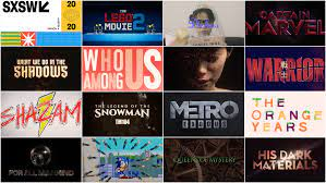
● Font: The opening credits of my film will appear in a digital/mathematical font that appears to be “typed” into the near center of the screen. Easy to see.
● Contrast: Some credits, though few, will be embedded in the setting. For example, credits will be written on the TV, or the blank walls. Avoids difficulty seeing.
● Working Title: The title of this film is likely to be “The Vanished”. Remains suspenseful.
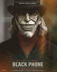
● It will be Bold Face Font and in all Caps: SOMETHING ALONG THIS STYLE. Highlights title.
● Titles will all be “Typed” on to the screen. They will come on as being typed and disappear with a either a fade or with a change of scenery. Adds neatness.
● Titles will disappear after 2 or 3 seconds. Makes it smooth.
● Depending on the color of the scene I will be using Black and White Font. All Mixed. It will look something like this: DIRECTED BY: TEO BALSAMO. Create visually pleasing title.
● The first name of the person who hold the job will be 2 sizes larger than the rest of the words. DIRECTED BY: TEO BALSAMO. Create visually pleasing title.


Comments
Post a Comment